DTC store and product page examples: what 25 live pages do above the fold

Converting DTC stores and product pages use the first screen to answer three questions: what is this, why should I trust it, and what is the offer. Across the 25 live pages below, that means a plain benefit headline, a rating line, a trust or press strip, and on product pages a buy box with bundle tiers and a subscribe and save option.
Key takeaways
- The point of sale is where the money changes hands: gallery, buy box, offer structure and subscription flow. Most of the CVR lifts in my results ledger came from testing here.
- Store homepages lead with one benefit headline, a star rating and one main shop button, with the product grid below.
- Product pages put the decision in the buy box: labeled bundle tiers, a subscribe and save option, guarantee lines near the button.
- Offer capture fires early: five of the 25 captures show an email, SMS or scratch card popup on first load.
- At the brand level, a full funnel rebuild with a PDP restructure lifted Natural Rems 40% in conversion rate and 25% in average order.
Why does the product page matter so much in a DTC funnel?
Because it is where the money changes hands. Full stores, landing pages and product pages carry the gallery, the buy box, the offer structure and the subscription flow, and most of the CVR lifts in my results ledger came from testing here.
A listicle or advertorial warms the click, but the order happens at the buy box. The buy box also sets what each order is worth: bundle tiers, free gifts and the subscribe option all move average order and repeat revenue.
The 25 pages below are the websites and PDPs on my portfolio proof wall, pages I built, rebuilt or ran the testing program on, grouped into full stores, product pages and landing pages.
What do DTC store homepages show above the fold?
The clearest store homepages say what the brand sells in one line, show a rating near that line, and give one main button to start shopping. The product grid comes after the first screen.
Supplement, wellness and pet stores
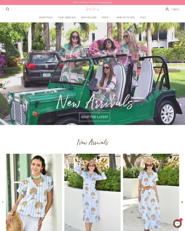
Food, drink, fashion and jewelry stores
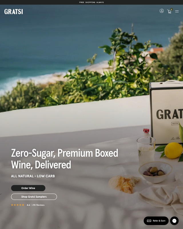
Gratsi is the cleanest one-line pitch on the wall: a full-bleed lifestyle photo, "Zero-Sugar, Premium Boxed Wine, Delivered", a two-claim subline (all natural, low carb), an "Order Wine" button, a secondary samplers button and a star rating with a review count.
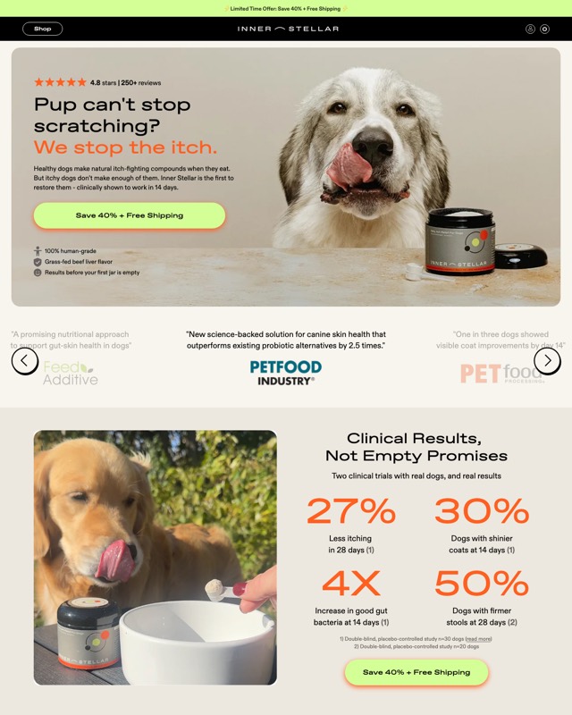
Innerstellar Pet opens its store like a landing page. The headline asks the owner's question, "Pup can't stop scratching?", and answers it, "We stop the itch.", with a rating line, one button and three trust lines, followed by trade press quotes and a "Clinical Results, Not Empty Promises" stat panel with a second button.
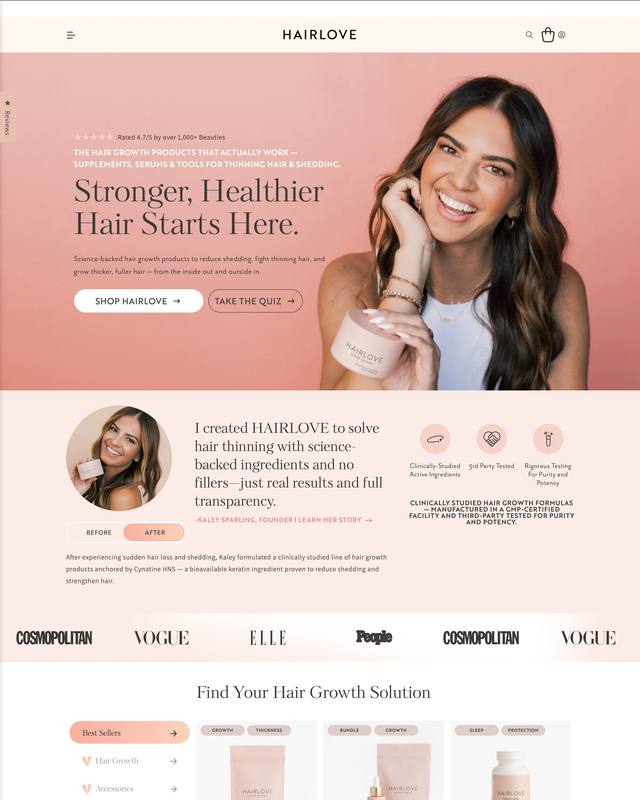
HairLove stacks founder proof into the first two screens: a rating line, "Stronger, Healthier Hair Starts Here.", a "Shop HairLove" button beside "Take the Quiz", then a founder's note with a before and after toggle and a strip of magazine logos.
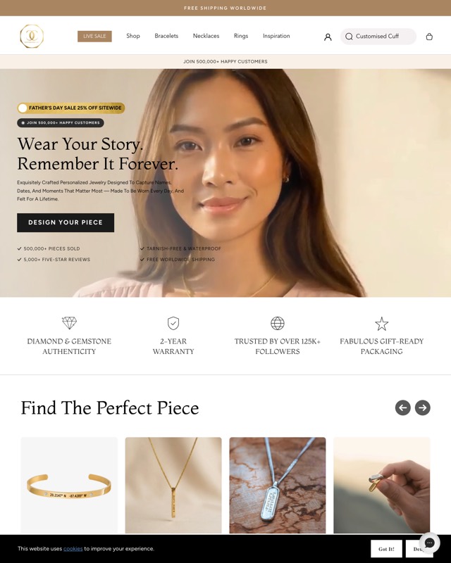
Customised Cuff, a personalized jewelry store, fills its hero with proof: a sale pill, a customer count badge, "Wear Your Story. Remember It Forever.", a "Design Your Piece" button and four checkmarks, then a row of four trust icons.
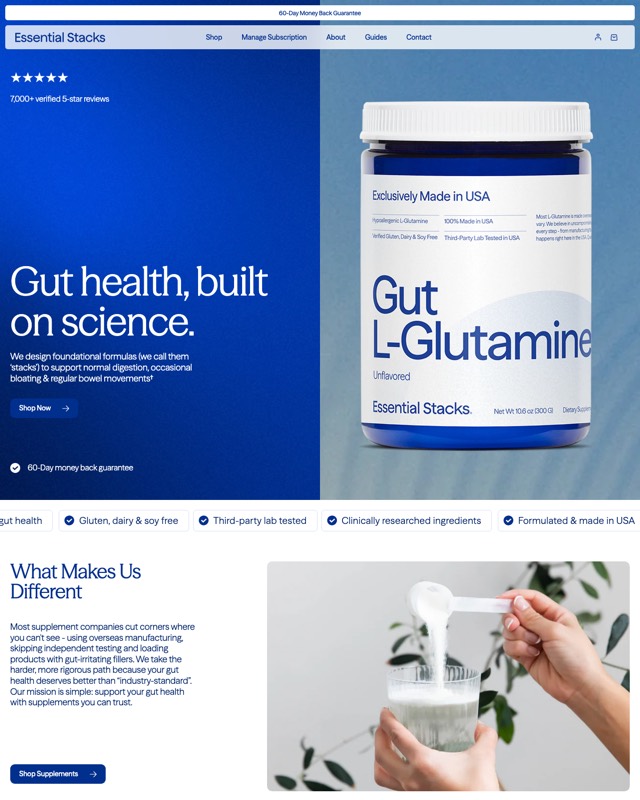
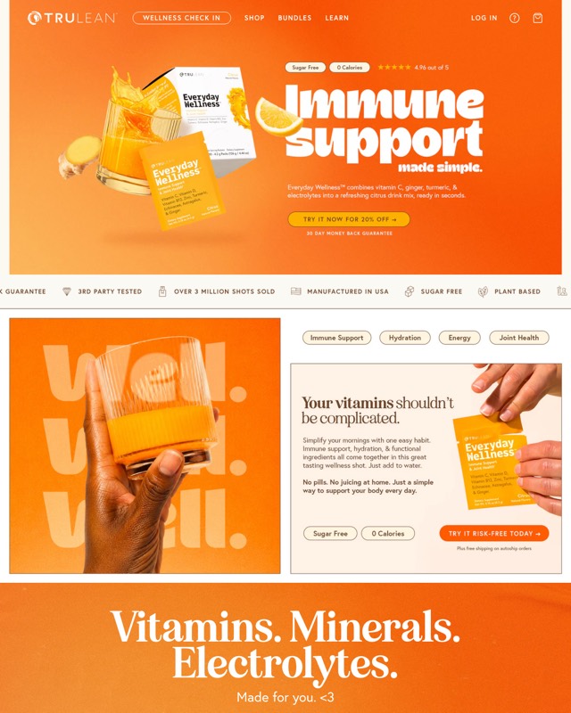
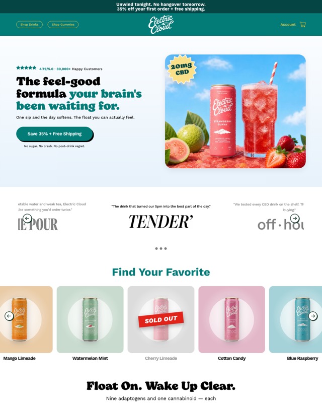
Essential Stacks, Trulean and Electric Cloud follow the same order: a rating line, a short benefit headline, one button, then a strip of badges or press quotes.
What do DTC product pages (PDPs) put above the fold?
A strong PDP puts the whole decision on the first screen: product name, rating, a one-line benefit, the gallery, and a buy box that settles bundle, flavor and subscription before the Add to Cart button.
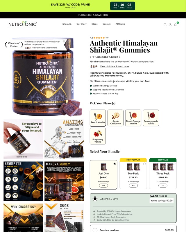
Nutrotonic's Shilajit Gummies PDP has the most complete buy box on the wall. A rating sits above the title; under it come a "Clinicians' Choice" badge with a clinician-endorsement line, three benefit bullets and a flavor picker.
Then a three-tier bundle selector ("Most Popular" on the two pack, "Best Value" on the three pack) with a per-serving price, and subscribe and save listed above one-time purchase with its perks checked off. The gallery is a grid of infographic tiles, including "Why choose us?" and an "Ours vs theirs" comparison.
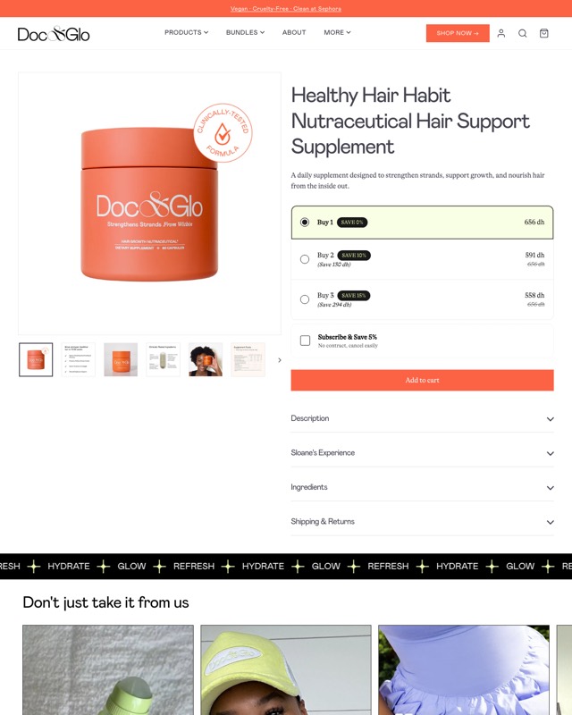
Doc & Glo's Healthy Hair Habit PDP is the quiet version: title, a one-line description, three quantity tiers with save tags, a subscribe and save checkbox ("No contract, cancel easily"), Add to Cart, and accordions for description, a "Sloane's Experience" story, ingredients, and shipping and returns.
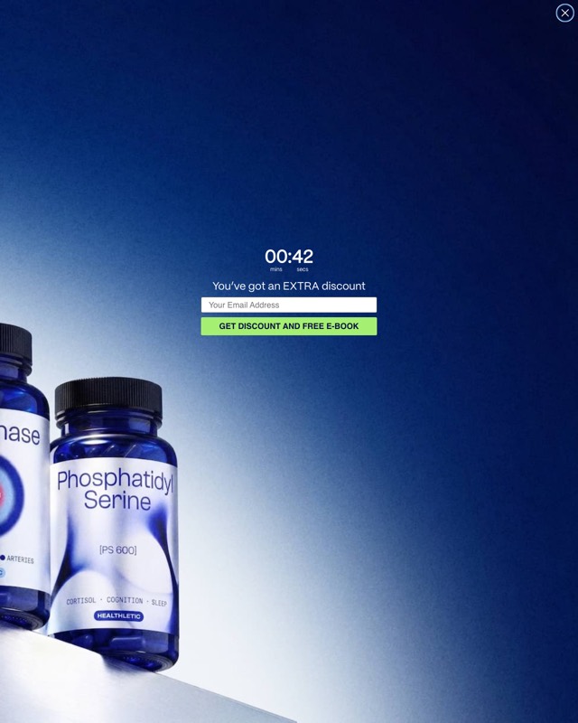
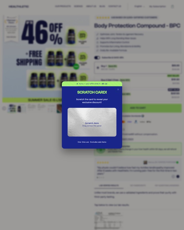
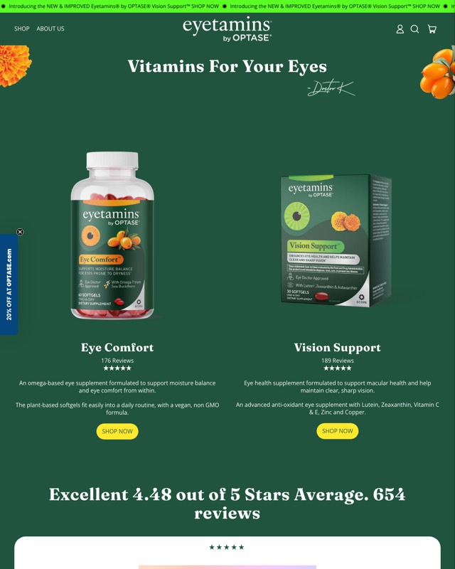
The Healthletic BPC-157 capture is covered by a "Scratch card!" popup with a countdown, over a blurred gallery and buy box. The Eyetamins capture shows a two-product "Vitamins For Your Eyes" layout with review counts under each product.
What do the landing pages on the wall show above the fold?
The landing pages on the wall merge a pre-sell hero and a full buy box on one URL. The top sells the idea; the buy box sits one scroll down.
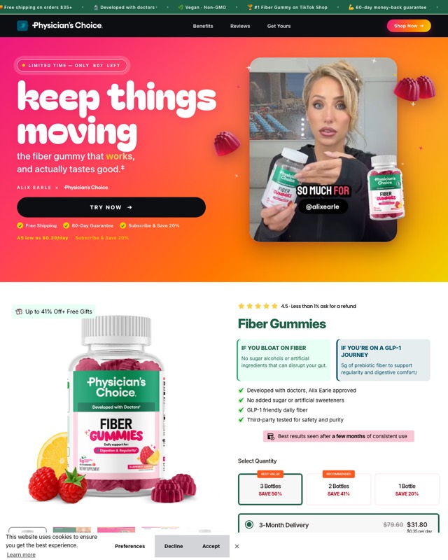
Physician's Choice Fiber Gummies landing pairs "keep things moving" with a creator co-brand line and a creator video, a limited-stock pill, a "Try Now" button and three checkmarks, under a ticker of trust claims.
Its buy box speaks to two readers with side-by-side cards, "If you bloat on fiber" and "If you're on a GLP-1 journey". It sets expectations ("Best results seen after a few months of consistent use") before a quantity selector labeled "Best Value" and "Recommended".
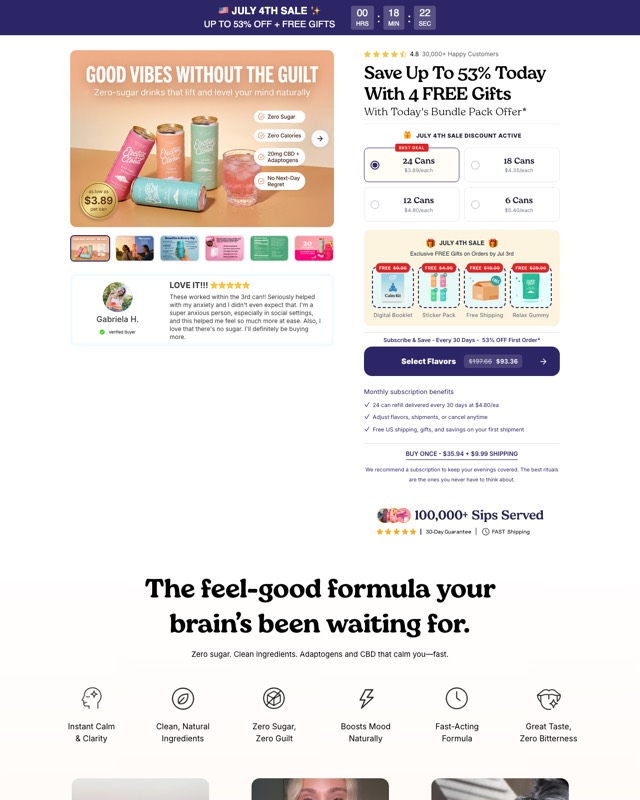
Electric Cloud's EC71 landing is built around the offer: a countdown sale bar, a headline that leads with savings and 4 free gifts, four bundle sizes with "Best Deal" on the largest, and a row of gift tiles. Subscribe and save is the main button ("Select Flavors"), "Buy once" is a text link, and a line under it recommends the subscription outright.
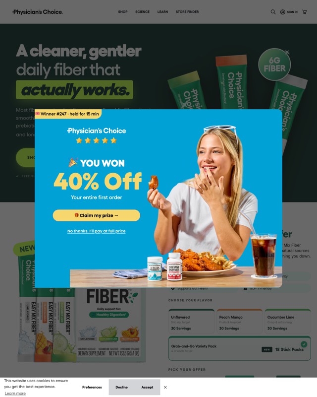
The Easy Mix Fiber landing opens on a hero ("A cleaner, gentler daily fiber that actually works."), then flavor tiles, a variety pack and a "Pick your offer" step.
What above-the-fold elements show up again and again?
Ten elements recur across the 25 screenshots. Use them as a checklist for your own first screen, then test each one you add against the control.
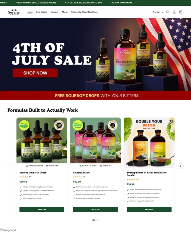
- An announcement bar with shipping, a guarantee, a sale or a subscription offer. Most of the 25 have one.
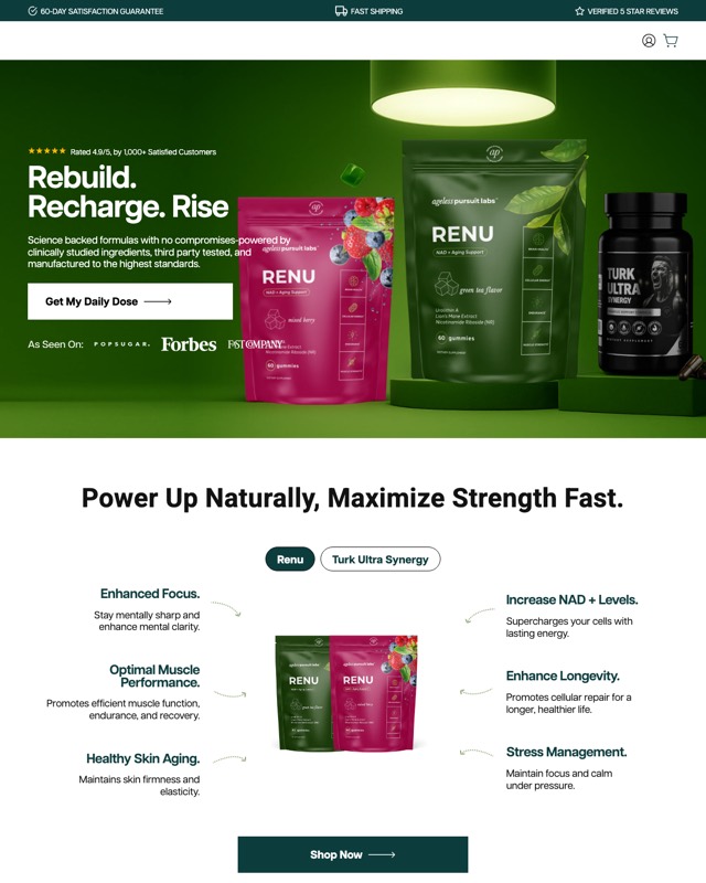
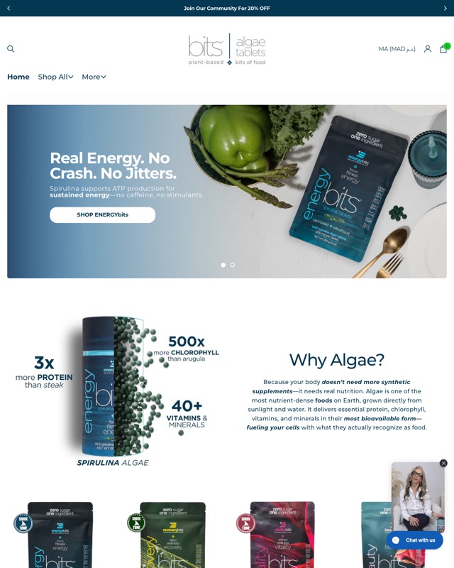
- One plain benefit headline: "Zero-Sugar, Premium Boxed Wine, Delivered", "Gut health, built on science.", "Real Energy. No Crash. No Jitters."
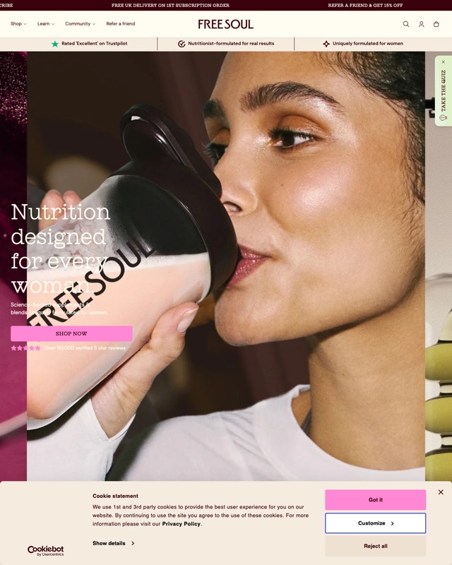
- A rating line near the headline, as on Gratsi, AP Labs, Free Soul, Innerstellar, Essential Stacks, HairLove, Trulean, Electric Cloud and the Nutrotonic PDP.
- One primary button with a verb: "Order Wine", "Get My Daily Dose", "Design Your Piece", "Try Now".
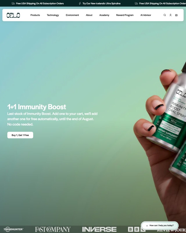
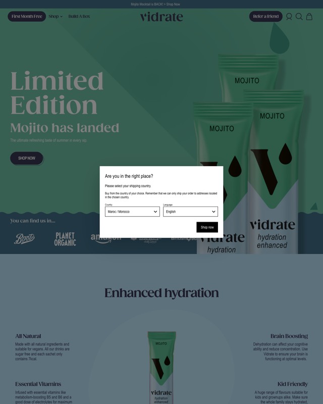
- A trust strip in or near the hero: press logos (AP Labs, HairLove, Orlo), trade press quotes (Innerstellar), retailer logos (ViDrate) or badge rows (Essential Stacks, Trulean, Customised Cuff).
- Labeled bundle tiers: "Most Popular", "Best Value", "Best Deal", "Recommended".
- Subscribe and save placed first, as on the Nutrotonic PDP and the EC71 landing.
- Guarantee and shipping lines near the button.
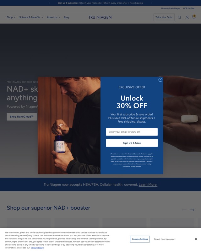
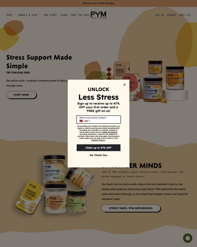
- A quiz entry point for undecided shoppers: Free Soul, HairLove, Tru Niagen and PYM all show "Take the Quiz".
- An offer capture popup on first load: email on Healthletic and Tru Niagen, SMS on PYM, a scratch card on the BPC-157 PDP.
Each one is a hypothesis until it beats the control on your traffic.
What results come from testing the point of sale?
The biggest numbers in my results ledger came from programs that included the point of sale. They are brand-level results, so I do not credit any of them to a single page above.
- Natural Rems: a full funnel rebuild covering PDP restructure, offer architecture and the post-click flow. Conversion rate rose 40% and average order rose 25%. Read the Natural Rems case study.
- Physician's Choice: a sitewide testing program across 580K monthly sessions, covering PDPs, landing pages, offer and subscription flow. The store reached a 3.95% conversion rate with ~50% subscription adoption, as program levels rather than lifts. Read the Physician's Choice case study.
The loop behind both: audit where the money leaks, rank fixes by revenue impact, A/B test against the control, roll winners sitewide. Details in the CRO testing process.
FAQ
What should be above the fold on a DTC product page?
The product name, a rating with a review count, a one-line benefit, the gallery, and a buy box that settles quantity, flavor and subscription before the Add to Cart button, with guarantee and shipping lines near it. The Nutrotonic and Doc & Glo PDPs show a loud and a quiet version of it.
Should subscribe and save be the default on a product page?
Several pages on the wall lead with it: the Nutrotonic PDP lists subscribe and save above one-time purchase, and Electric Cloud's EC71 landing makes the subscription the main button with "Buy once" as a text link. Whether it should be your default is a test. At Physician's Choice, the program level is ~50% subscription adoption.
Do popups hurt conversion on DTC stores?
They can help or hurt, and only a test against the control tells you which. Five of the 25 captures show an offer popup on first load, such as email, SMS or a scratch card. If you run one, judge it on orders and revenue per visitor as well as signups; I explain why in conversion rate vs revenue per visitor.
How many bundle options should a buy box offer?
The pages here use three or four tiers: three on the Nutrotonic PDP, Doc & Glo and the Physician's Choice fiber landing, four on Electric Cloud's EC71 landing. Most label a tier ("Most Popular", "Best Value", "Best Deal") so the shopper has a default to lean on; Doc & Glo uses save tags instead. The right count is the one that wins on revenue per visitor against your control.
Sources
- Hamid Chakir portfolio: results ledger, format notes and method
- Portfolio proof wall: 39 live pages
- Gratsi store (live page)
- AP Labs store (live page)
- Darviny store (live page)
- Free Soul store (live page)
- Innerstellar Pet store (live page)
- Customised Cuff store (live page)
- Serene Herbs store (live page)
- Healthletic store (live page)
- Nutrotonic Shilajit Gummies PDP (live page)
- Physician's Choice Easy Mix Fiber landing (live page)
- Physician's Choice Fiber Gummies landing (live page)
- Tru Niagen store (live page)
- EnergyBits store (live page)
- Trulean store (live page)
- ViDrate store (live page)
- Organic Traditions store (live page)
- Essential Stacks store (live page)
- PYM store (live page)
- Electric Cloud store (live page)
- Electric Cloud EC71 landing (live page)
- HairLove store (live page)
- Doc & Glo Healthy Hair Habit PDP (live page)
- Healthletic BPC-157 PDP (live page)
- Orlo Nutrition store (live page)
- Eyetamins Blue Blocker PDP (live page)